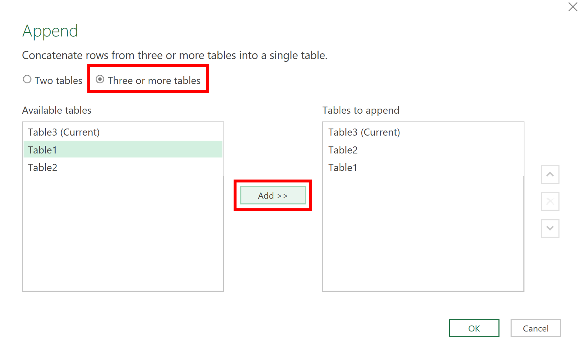
In Power Query the columns will automatically line up so long as they have the same column headings.
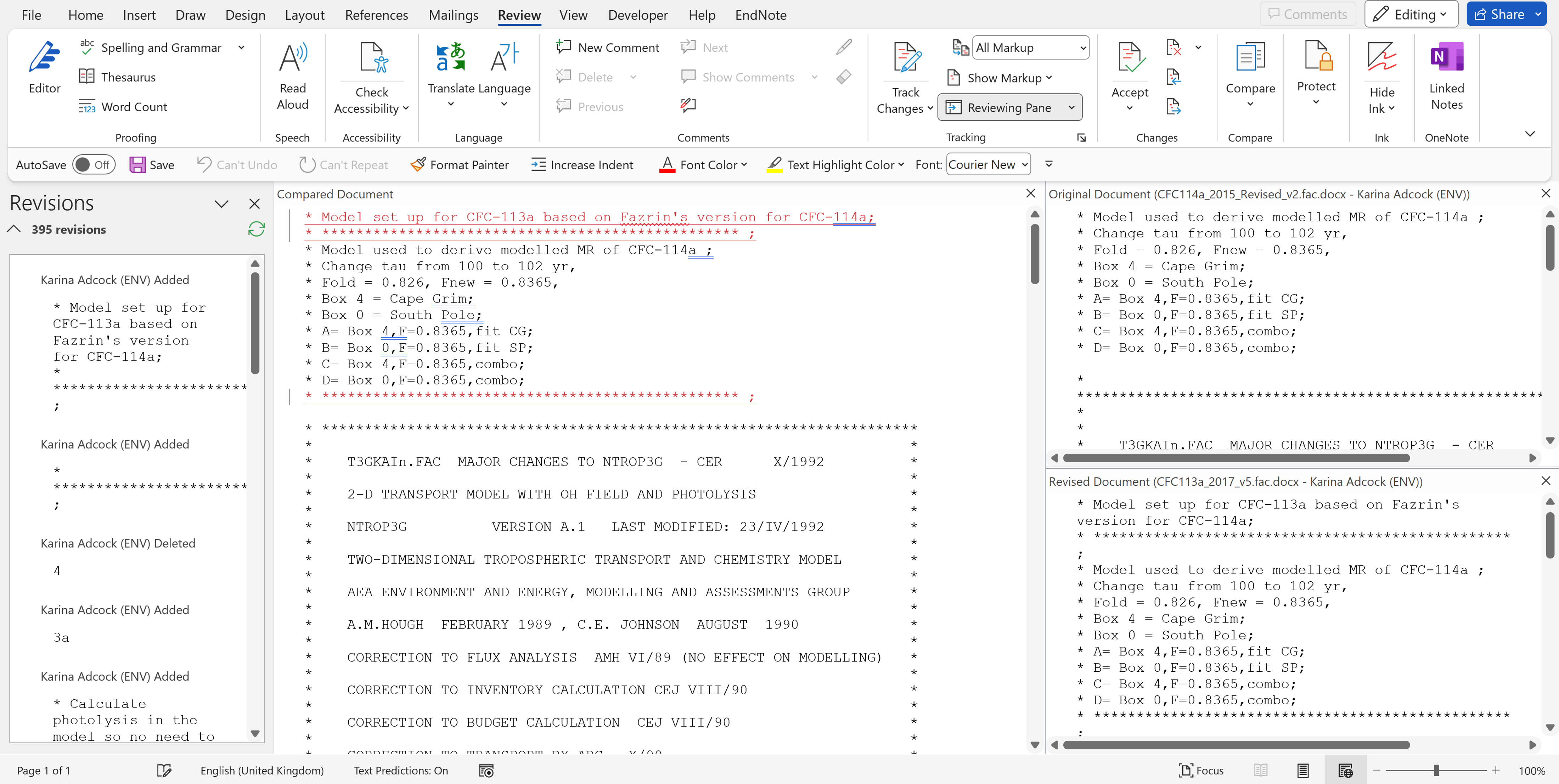
In Microsoft Word you can compare two documents to find all of the differences between those documents.
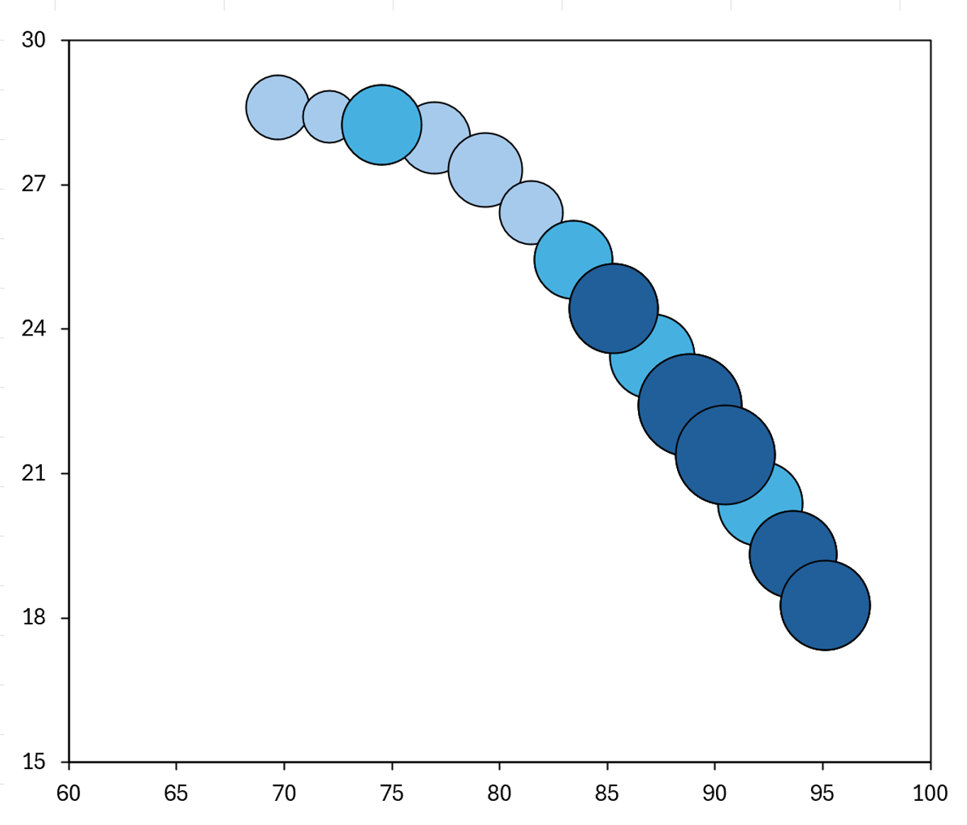
How to make the bubbles in a bubble chart different colors based on there values, and make it appear as if the chart has conditional formatting, by using an IF formula and making multiple different series.
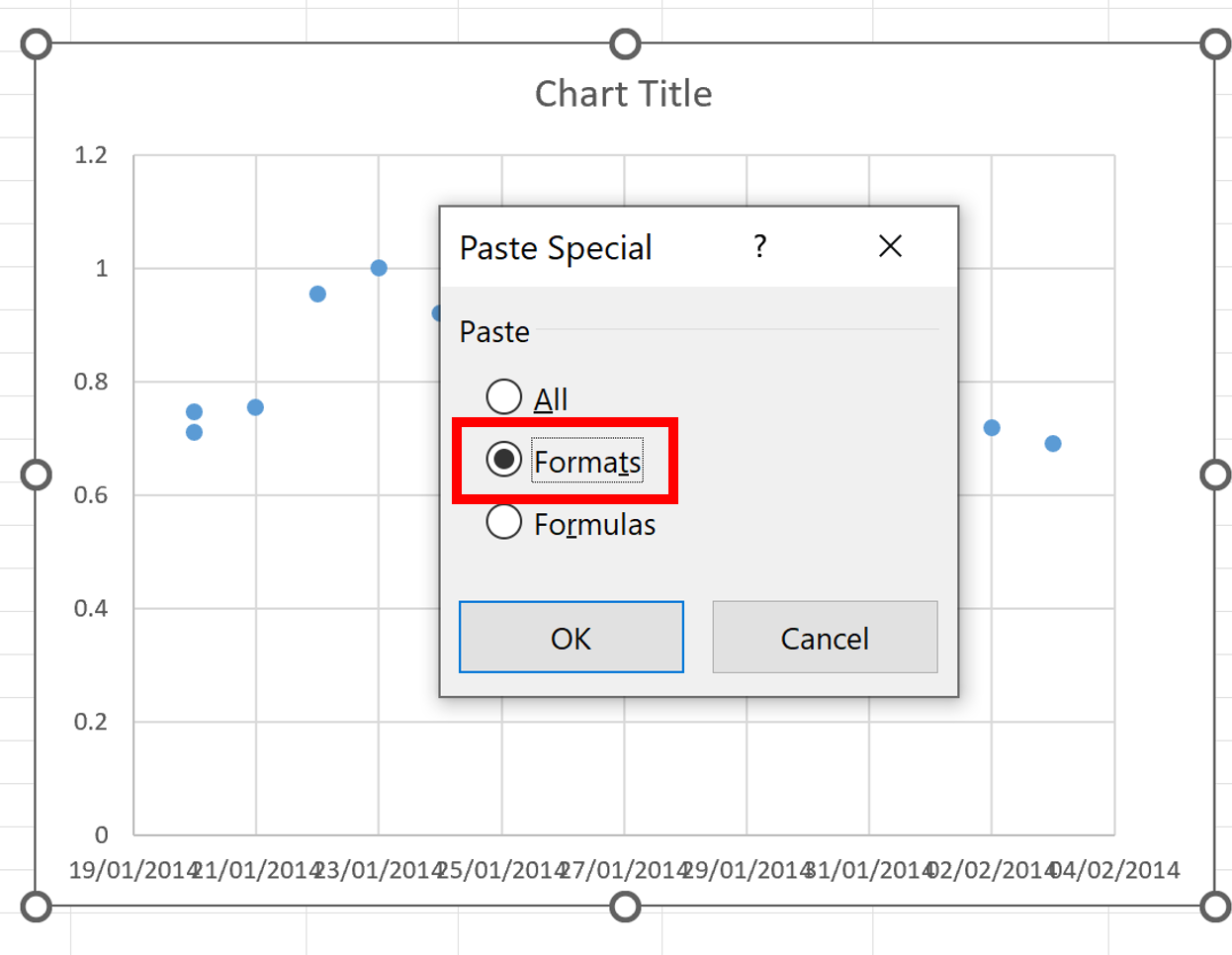
Quickly copy the formatting from one chart to another in excel and save the formatting to use later.
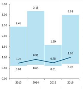
How to make a chart that shows the minimum, maximum and average values for each year.

The HYSPLIT model is an atmospheric transport model used to find out where the air mass at a particular location likely came from. HYSPLIT can be used online for free.
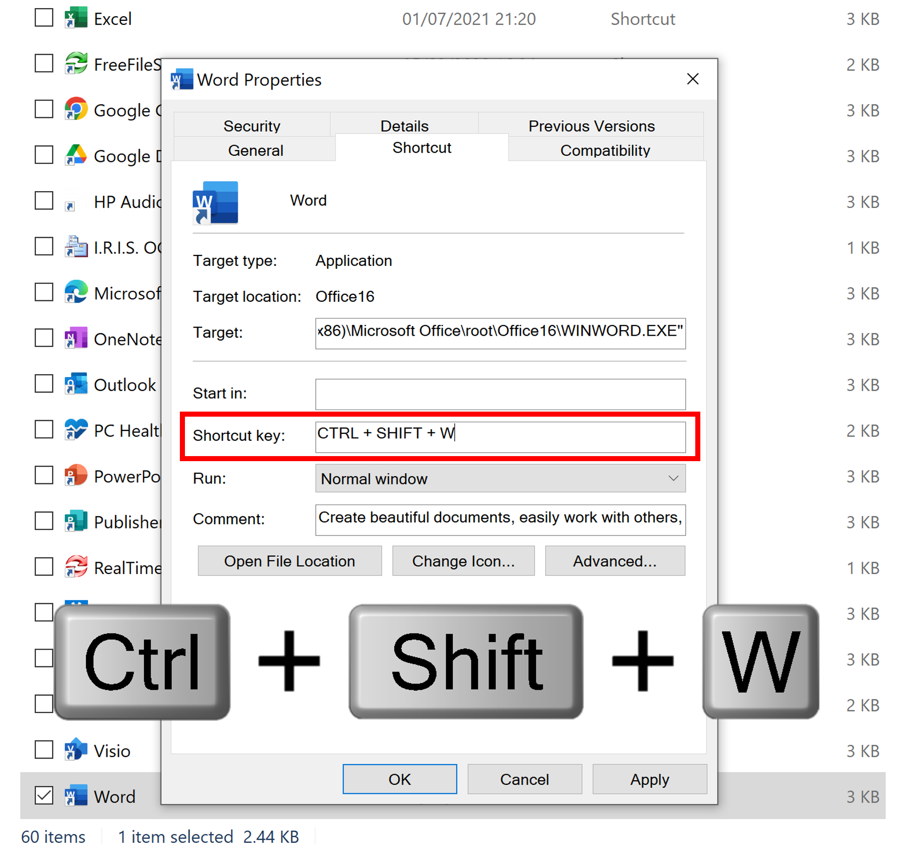
In Windows you can create custom keyboard shortcuts to make it easier to open programs that you use on a regular basis.
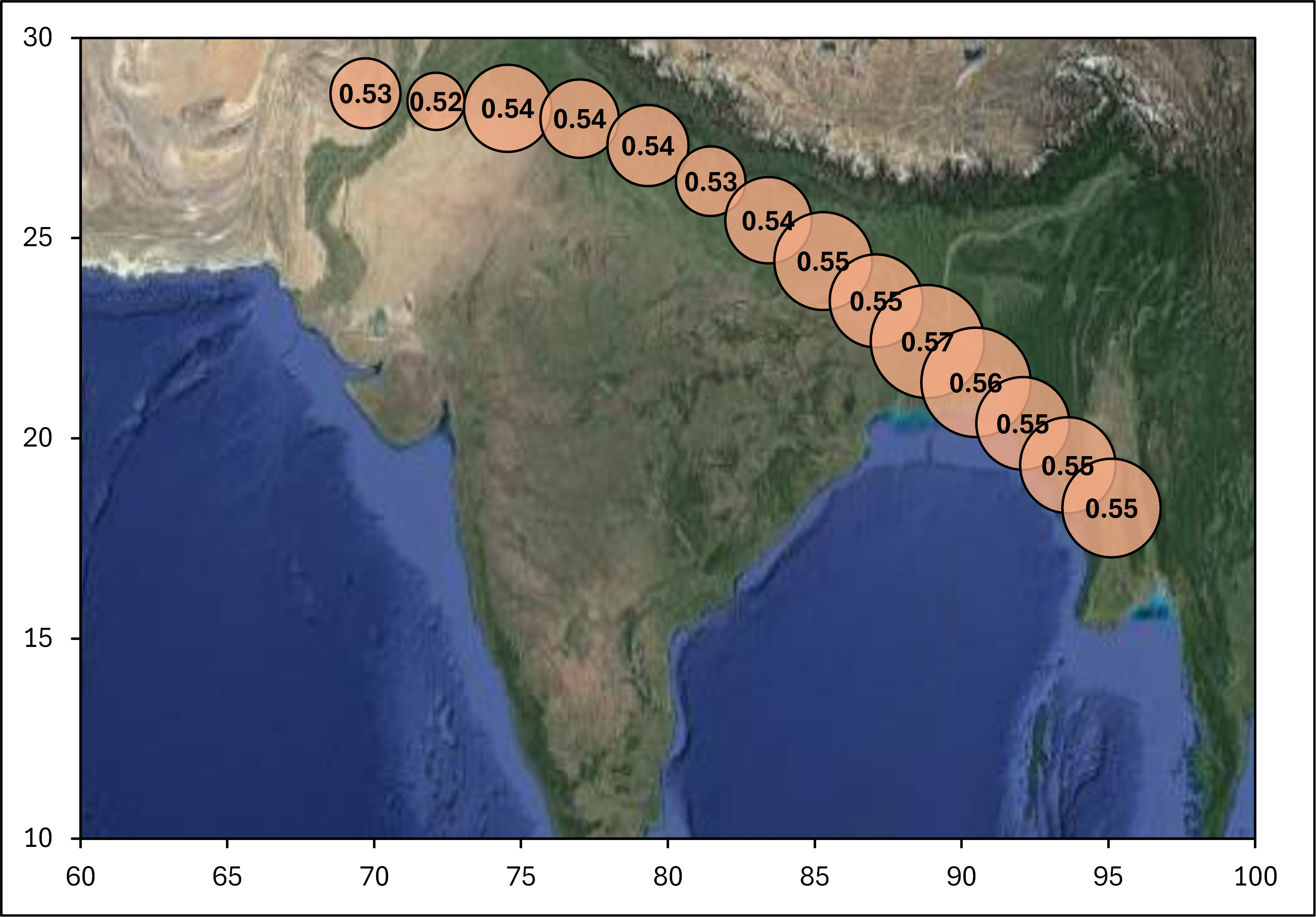
How to make a bubble chart map with latitude and longitude coordinates in excel.
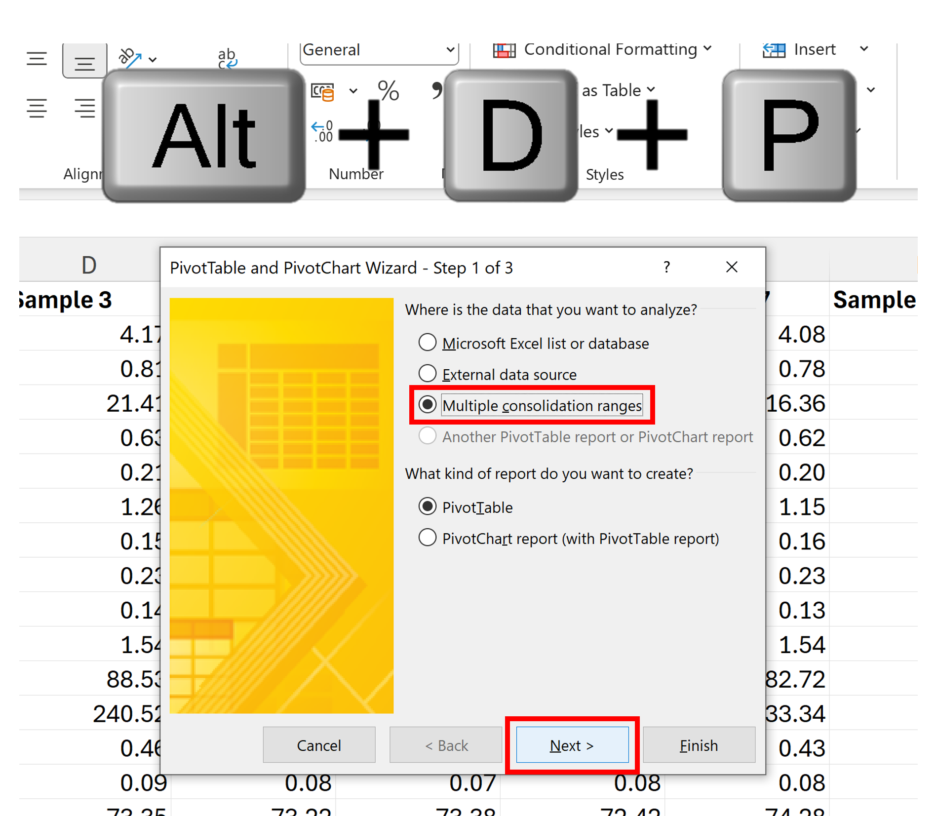
Rearrange a dataset using the old version of a Pivot Table

Google Scholar is a search engine that can be used to search the web for journal articles.
