
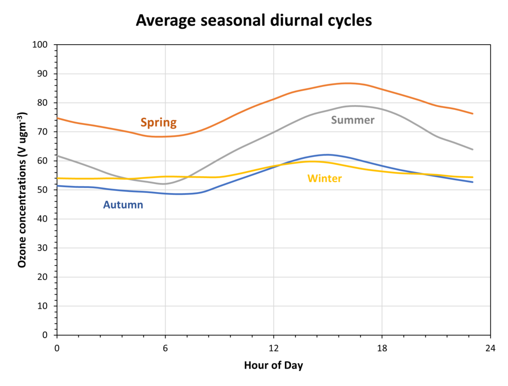
Chart of average seasonal daily (diurnal/diel) changes with pivot table
Summary
Use formulas to categorise the data into months and hours. Make a second table and a VLOOKUP formula to categorise the data into seasons. Next, make a pivot table and use it to calculate the average seasonal diurnal (daily/diel) cycles of ozone and then plot them on a scatter chart.
Step by Step guide
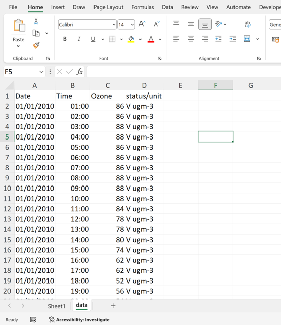
1. Download data from the UK-AIR DEFRA website. Hourly atmospheric ozone concentrations at Weybourne Atmospheric Observatory in the UK 2010-2014.
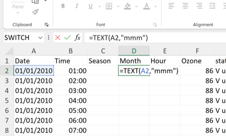
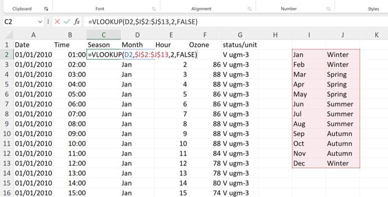
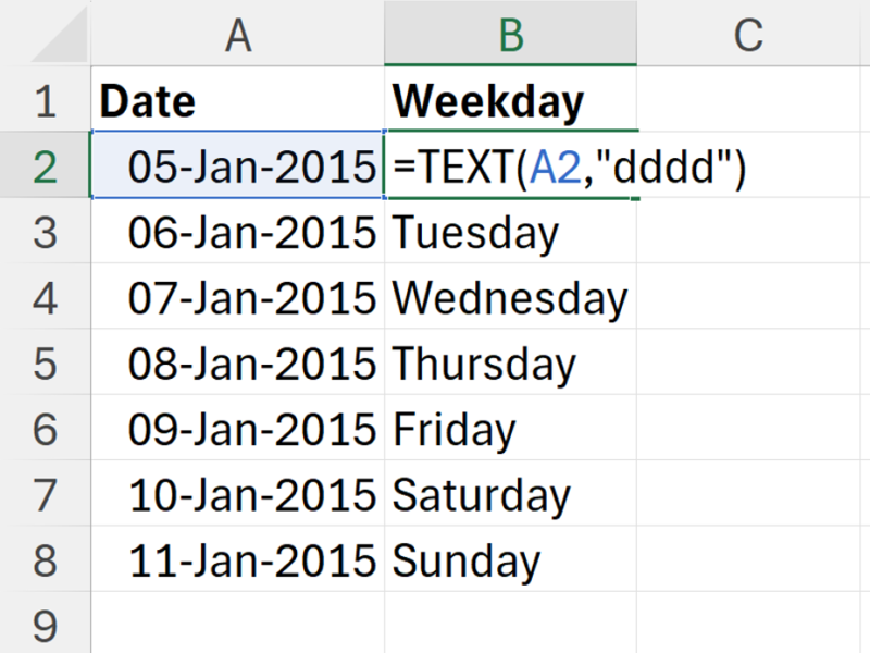
2. Make column for month
=TEXT(A2,”mmm”)
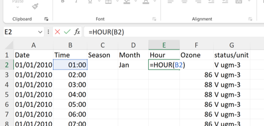
3. Make column for hour
=HOUR(B2)
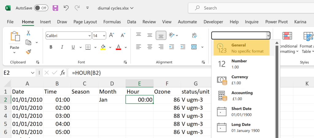
4. Change format of hour to General
5. Make a new table with two columns: column with months and column with seasons
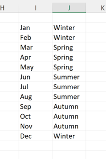
6. Make a column for the season using a VLOOKUP formula
=VLOOKUP(D2,$I$2:$J$13,2,FALSE)
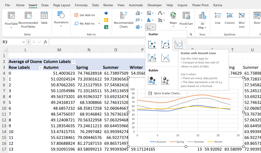
7. Select the whole table and Insert a Pivot Table
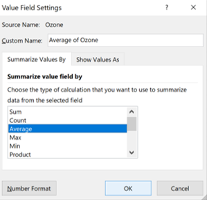
8. Move Ozone into the value field and left click and go to Value Field Settings
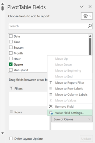
9. Change it from Sum to Average
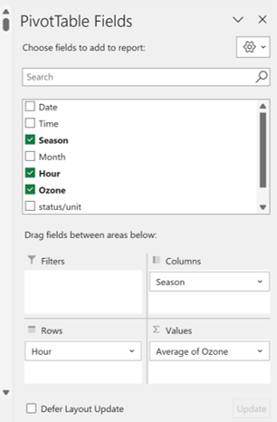
10. In order to get average seasonal daily (diurnal/diel) cycles: drag hours into Rows and drag seasons into Columns
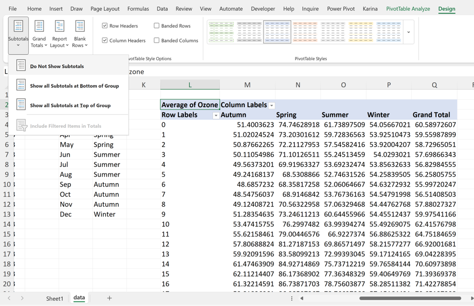
11. On the Design tab remove the Subtotals and the Grand Totals
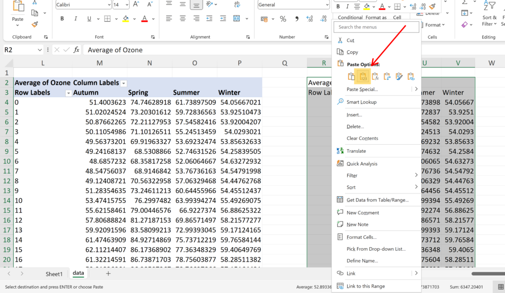
12. Excel won’t let you make a scatter chart from a pivot table so copy the whole table, right click and Paste As Values
13. Select the new table and Insert a Scatter chart with Smooth Lines
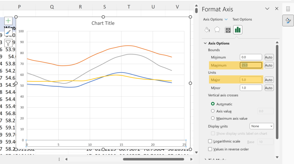
14. As the horizontal axis is showing hours, change the Axis Maximum from 25 to 24 and change the Major Unit from 5 to 6
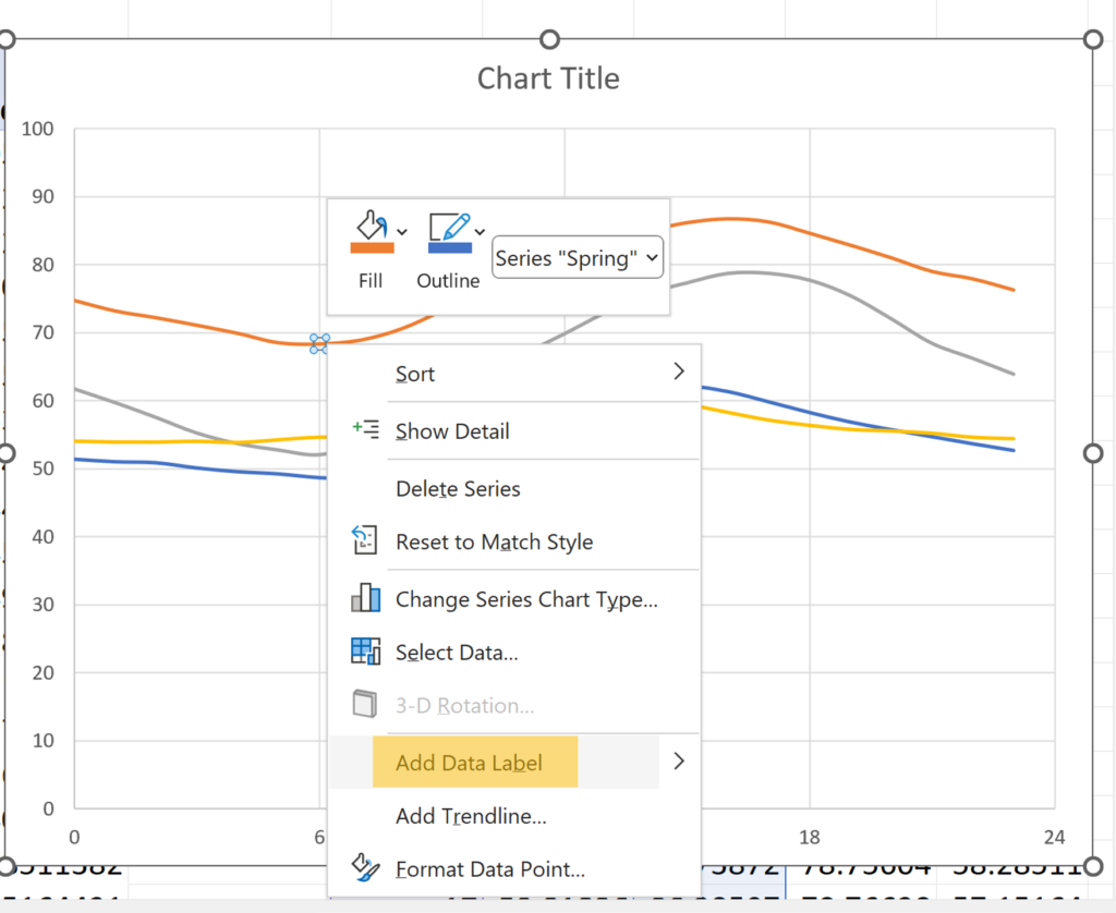
15. For each of the lines, double click on a line to select just one point. Then right click and add a Data Label.
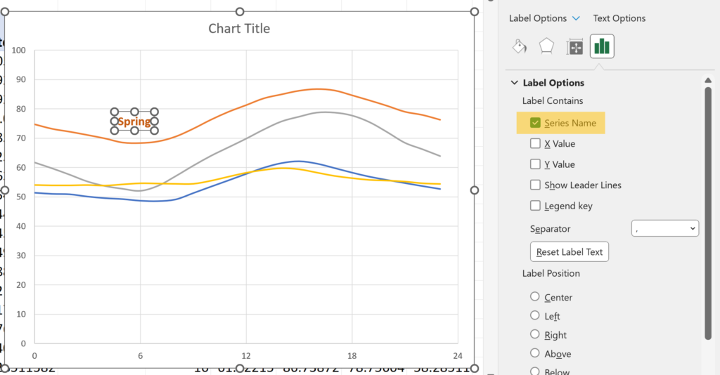
16. Change the data label to Series Name so we can easily tell the lines apart
Final Result
One thought on “How to plot average seasonal daily cycles in excel”
Comments are closed.