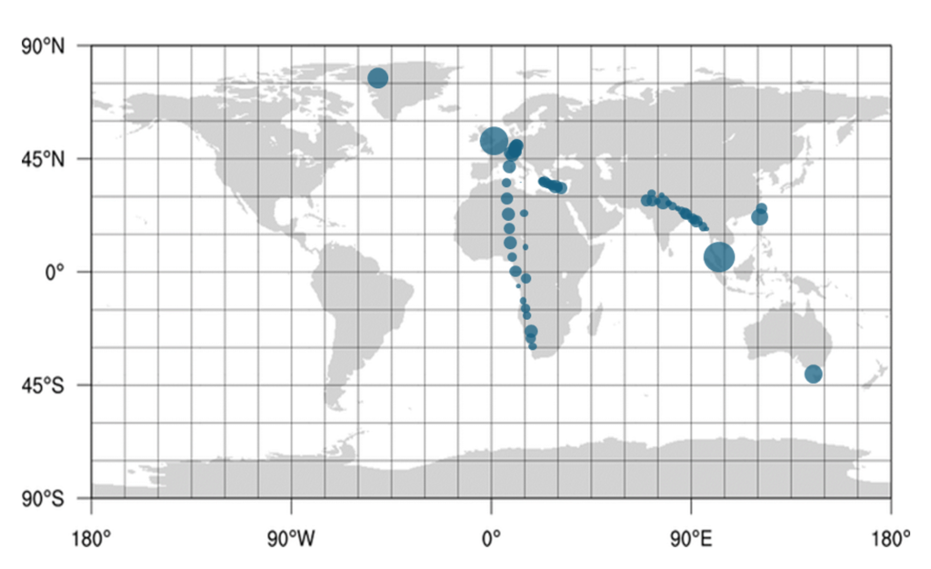
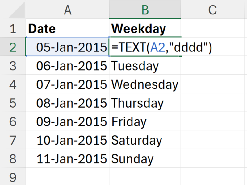
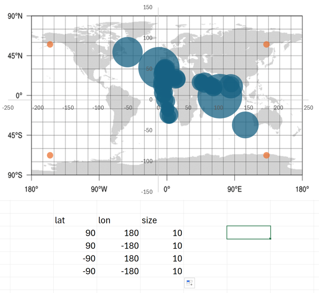
In this example, I have latitude and longitude coordinates of locations where samples were collected, and I will plot these on a map using a bubble chart in excel, where the size of the bubble represents the values that were measured in the samples. This is done by changing the background of the chart into an image of a map and then changing the x-axis & y-axis minimum & maximum to line up with the image underneath.
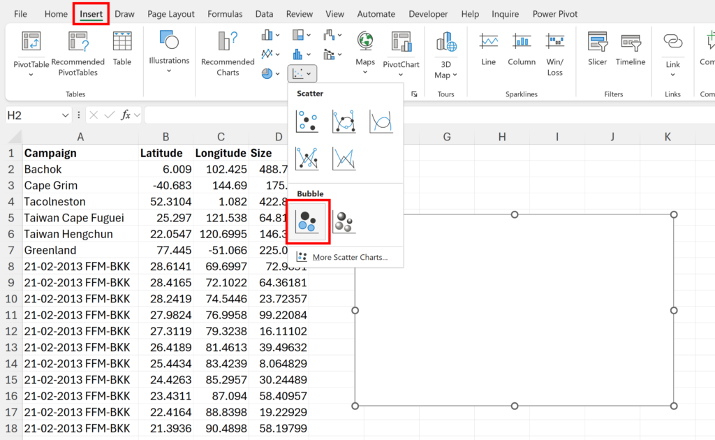
Firstly, click in a blank cell away from your data and go to the Insert Tab and insert a empty bubble chart.
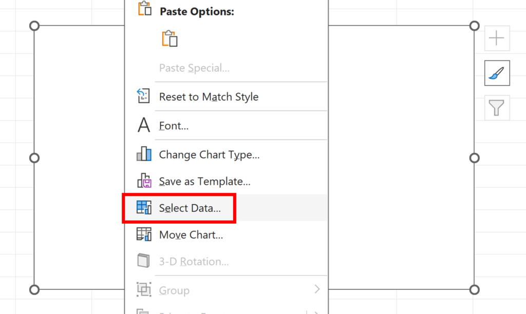
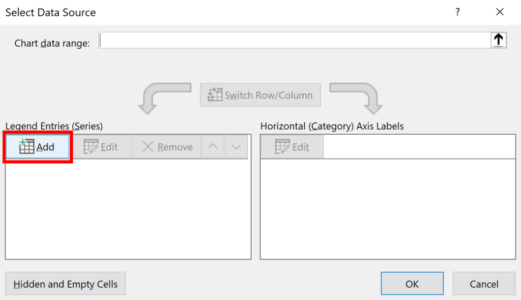
Right click on the chart and click Select Data…
Add a new series to the chart.
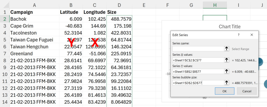
Select the columns with your data, the longitude is the x-values and the latitude is the y-values. If you have a cell in the table selected when you insert the bubble chart, excel will try and guess which column is which, but its usually not very good at this, so in general its easier to just select the columns yourself.
Delete the chart title and grid lines from the chart.
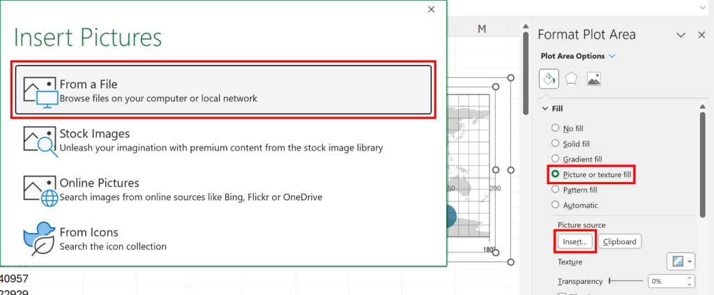
Double click on the Plot Area to open the formatting pane. Then change the Plot Area Fill to a Picture or texture fill, and Insert a Picture source. I used From a File, to insert a picture of a map that I had on my computer. You can get an image of a map from the internet, I recommend a map with grid lines as it will be easier to line up with the data points in the following step.
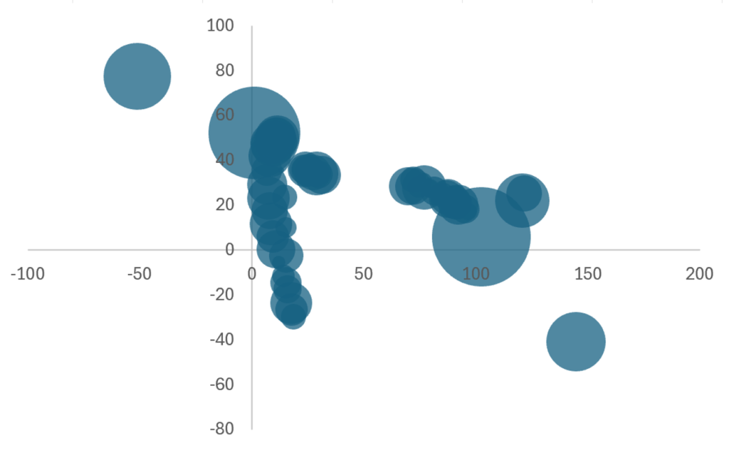
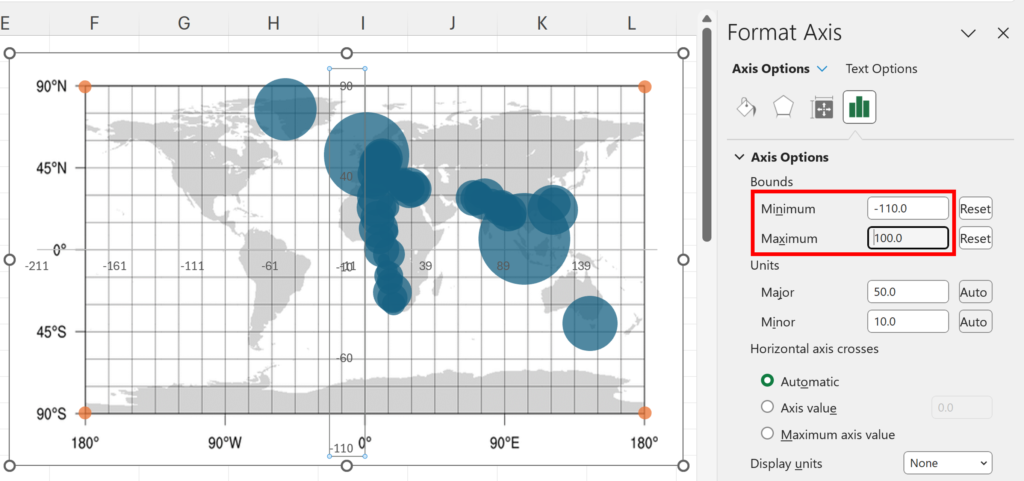
Next, add in another series of data, with four data points, which are the four corners of your map. I’m using a world map, so the latitude goes from 90 to -90, and the longitude goes from 180 to -180.
Adjust the y-axis and x-axis, minimum and maximum to move the four corner dots so they line up with the map underneath, in order to get all your actual data points in the correct place.
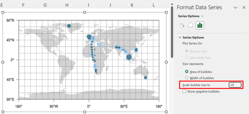
Now, delete the four corner points, and delete the horizontal and vertical axis. Finally, select the bubbles and change Scale bubble size to a number that makes your bubbles the size you want them to be, for example, 50 makes the bubbles 50% of there default size.
We have now made a bubble chart map in excel.