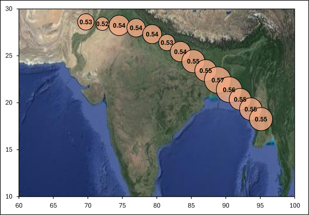
I have data from an aircraft campaign in which air samples were taken at regular intervals during a flight. I want to plot the data with the longitude and latitude of the location where each of the samples was taken from and the concentrations of the compound that was measured in the air samples as the size of the bubbles. I also want to show a map underneath the bubbles.
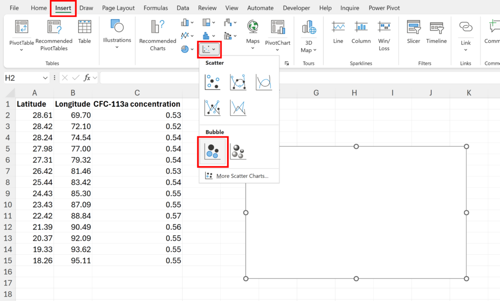
Click in a blank cell away from the data and go to the Insert tab and then insert a empty Bubble Chart.
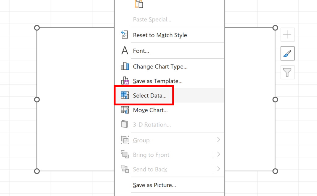
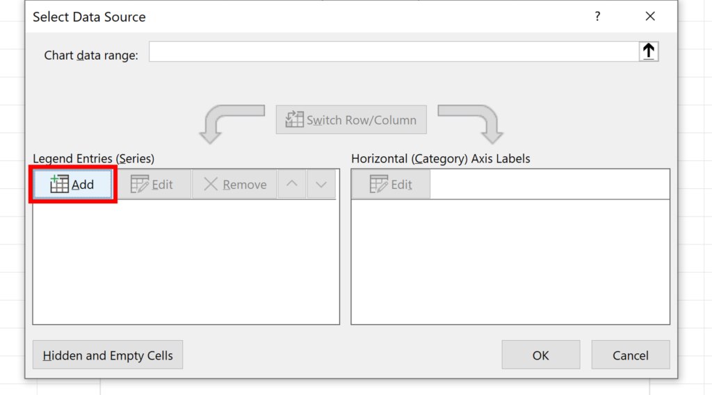
Right click on the chart, and click Select Data…
Click on Add to make a new series
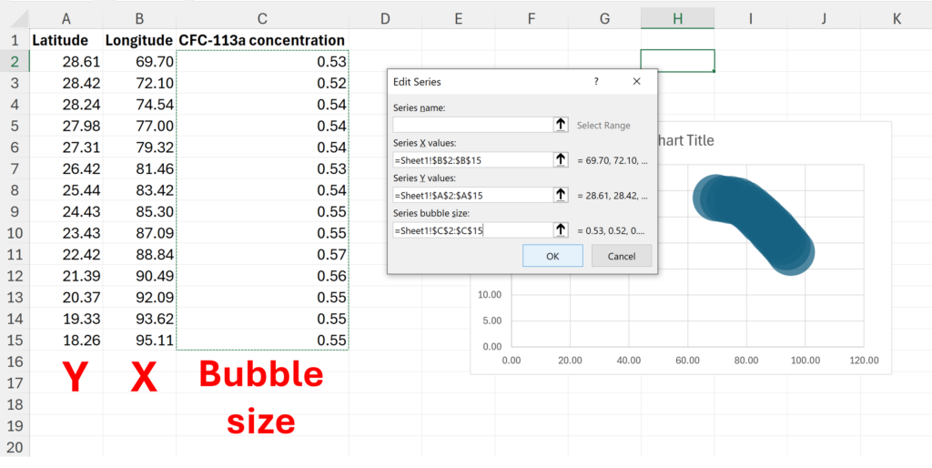
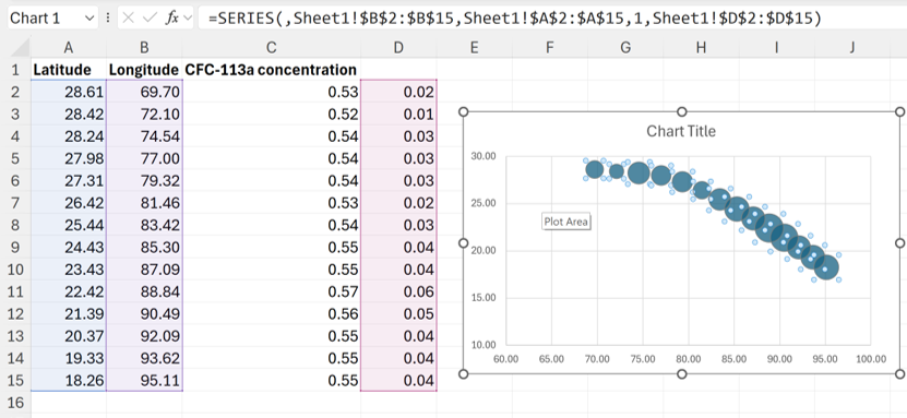
The longitude is the x values and the latitude is the y values, the concentrations are the size of the bubbles.
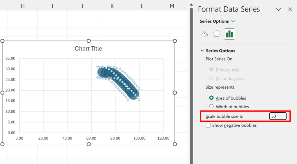
Adjust the “Scale bubble size to” so that the bubbles are the size you want them to be, for example, 50% will make the bubbles half the size.
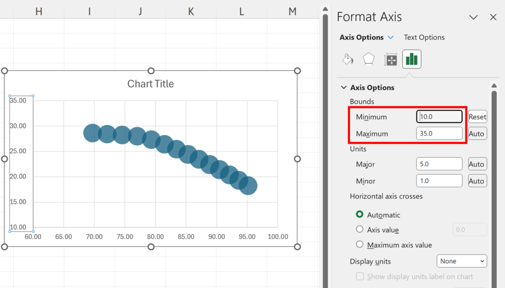
Adjust the axis maximum and minimum to spread out the bubbles.
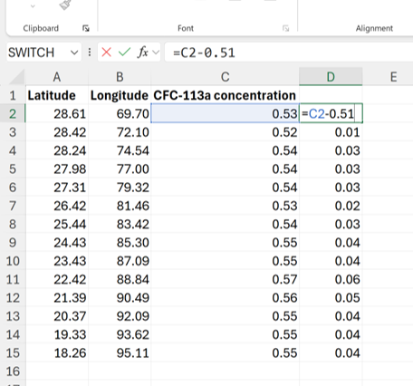
If your numbers are very similar the bubbles might all look the same size. This can be fixed by subtracting a number slightly less than the minimum number from all of the values. In my example, I’m subtracting 0.51 from all the values.
Then change the chart so that it’s plotting all the smaller numbers in this new column. This will increase the differences between the bubble sizes.
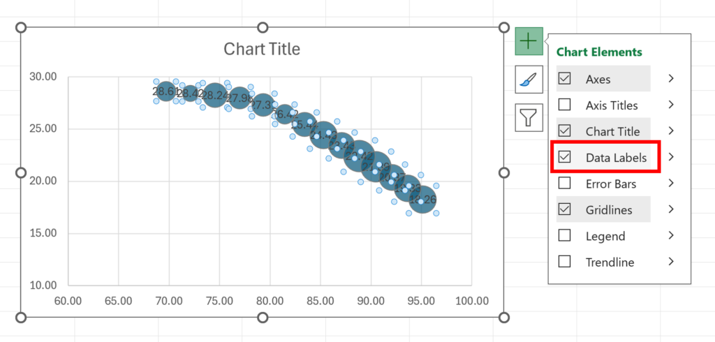
You can also click on the + symbol on the corner of the chart and add “Data Labels”
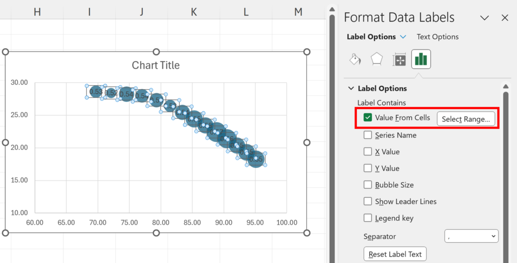
Change the Data Labels so that they are showing the bubble size. If you have changed the bubble sizes in the previous step, then you need to use “Values From Cells” instead to get the correct bubble sizes.
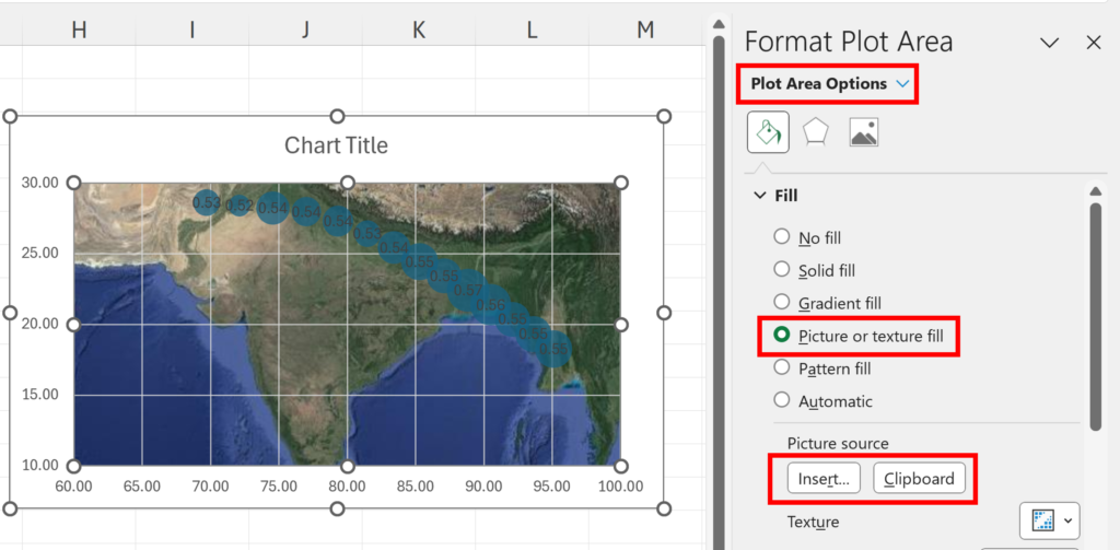
Get an image of the map you want with the same latitude and longitude maximum and minimum as your chart. Change the Plot Area Fill to be a Picture and then use your image of a map.
Now the bubbles are in about the same place on the map as the samples were collected.