It is possible to make the bubbles in a bubble chart different colors based on there values, and make it appear as if the chart has conditional formatting, by using an IF formula and making multiple different series.
This is the dataset I’m using as an example, which comes from this blog post here.
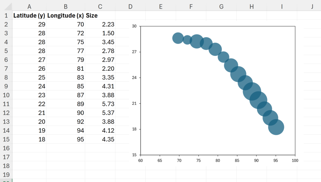
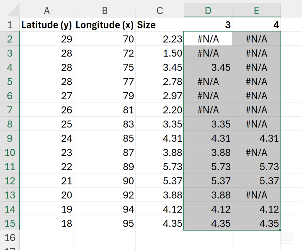
Firstly, my values are between 2 and 5. I want to separate them into three colors: values less than 3, values between 3 & 4, and values greater than 4. In order to do this I will add in two more columns, with the headings 3 & 4.
Next, I’ll create an IF formula, to test if the value is greater than the column heading, if it is greater, then I want to repeat the value, and if it is not, then I want to replace the value with NA(). The NA will stop it from being plotted in the chart.
=IF($C2>D$1,$C2,NA())
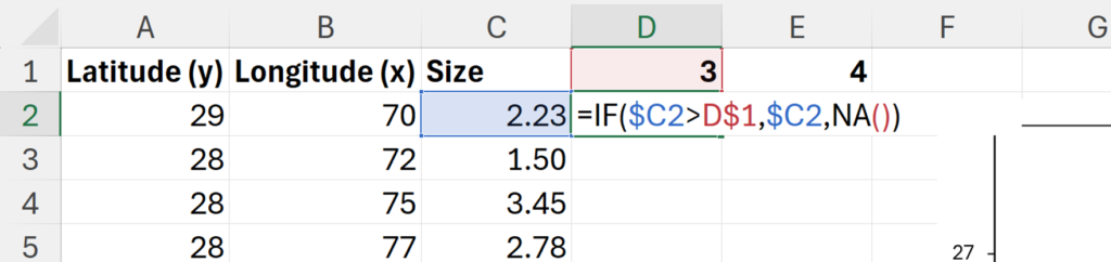
Make sure you put the dollar signs in the correct places in this formula, the cell reference for the values needs a dollar sign in front of the column letter, and the cell reference for the heading needs a dollar size in front of the row number.
If the dollar sizes are correct, you can then click and drag the formula to fill in the rest of the table.
Right click on the chart and click Select Data…
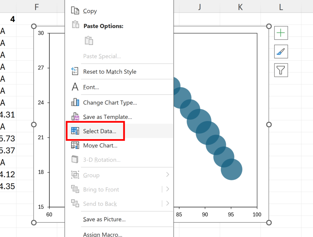
Add a new series to the chart.
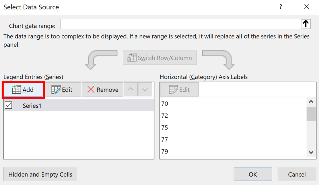
Use the same x and y values as the original chart, and for the bubble size, select the new column of data with the heading 3.
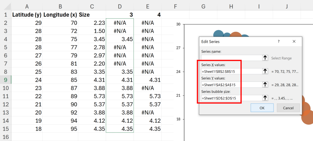
Repeat this progress to add another series of data for the column with heading 4.
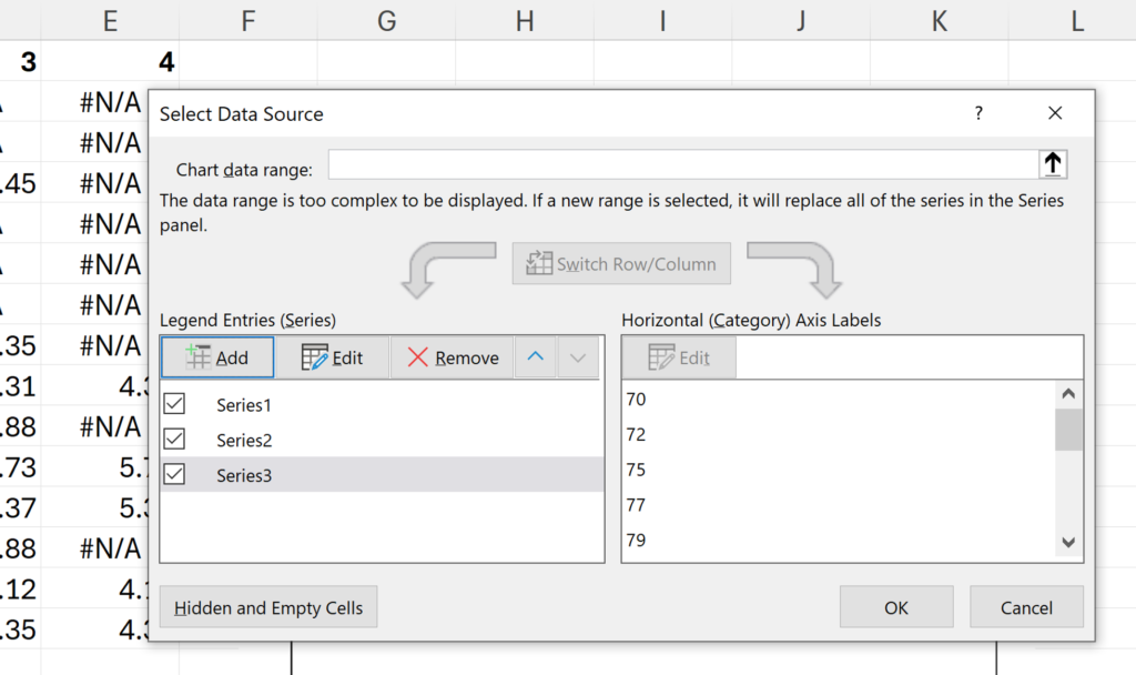
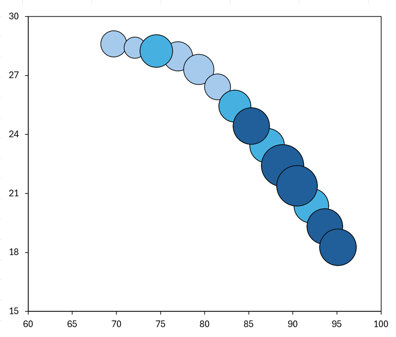
You will then have three series of data on the chart, stacked on top of each other, but not all of the data points will be plotted, so you should now see three different colors. Make sure you make these series in the correct order, from smallest number to largest, so they stack on top of each other in the correct order. The original series is now showing all the values less than 3.
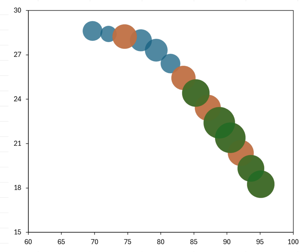
Double click on the chart to open the formatting pane, and then change the colors of the series so they look more like conditional formatting. In my example, values less than 3 (i.e. the original series) are now a light blue, values between 3 and 4 are a medium blue, and values greater than 4 are a dark blue.
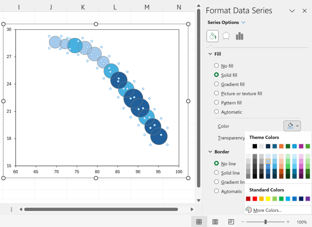
I also added a black border to all of the bubbles, to make it easier to tell them apart.
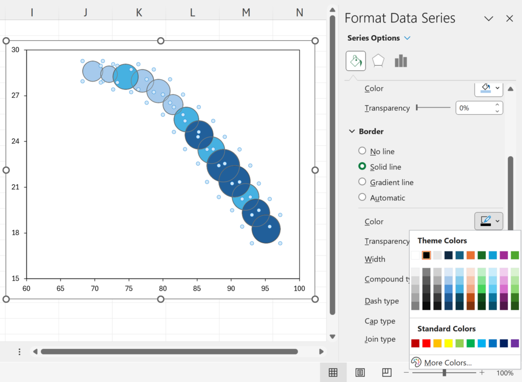
Now it looks like the chart is conditionally formatting with both the size and color indicating the value. Smaller numbers are a lighter blue, and the color gets darker as the size increases, so larger numbers are a darker blue.