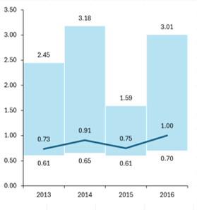
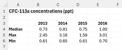
Firstly, I have a table with the minimum, median and maximum concentrations of a compound for four years from 2013 to 2016 (median is a type of average). I’m going to plot all these values on a chart.
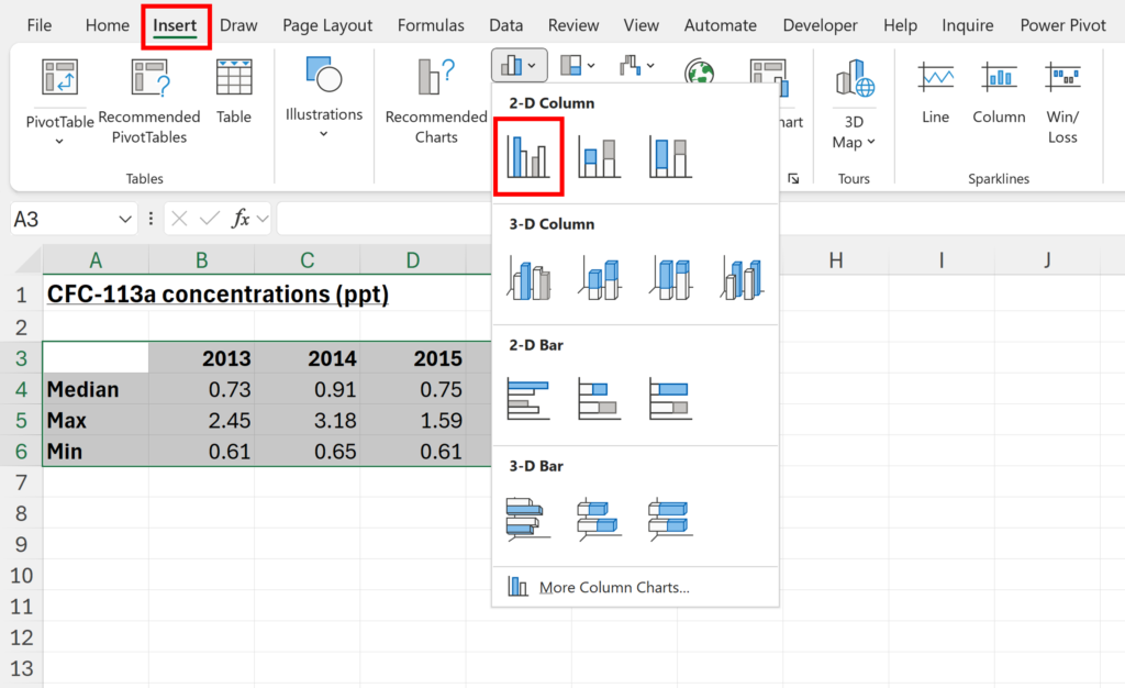
1. Select the whole table and go to Insert and insert a 2-D Clustered Column Chart
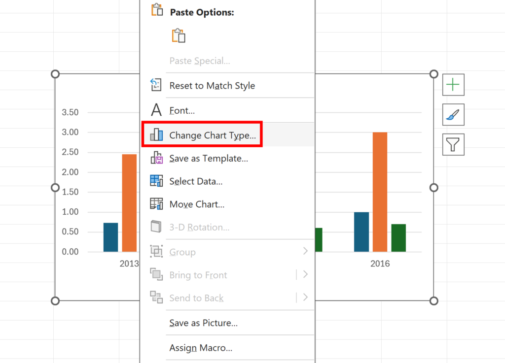
2. Right click on the chart and select Change Chart Type…
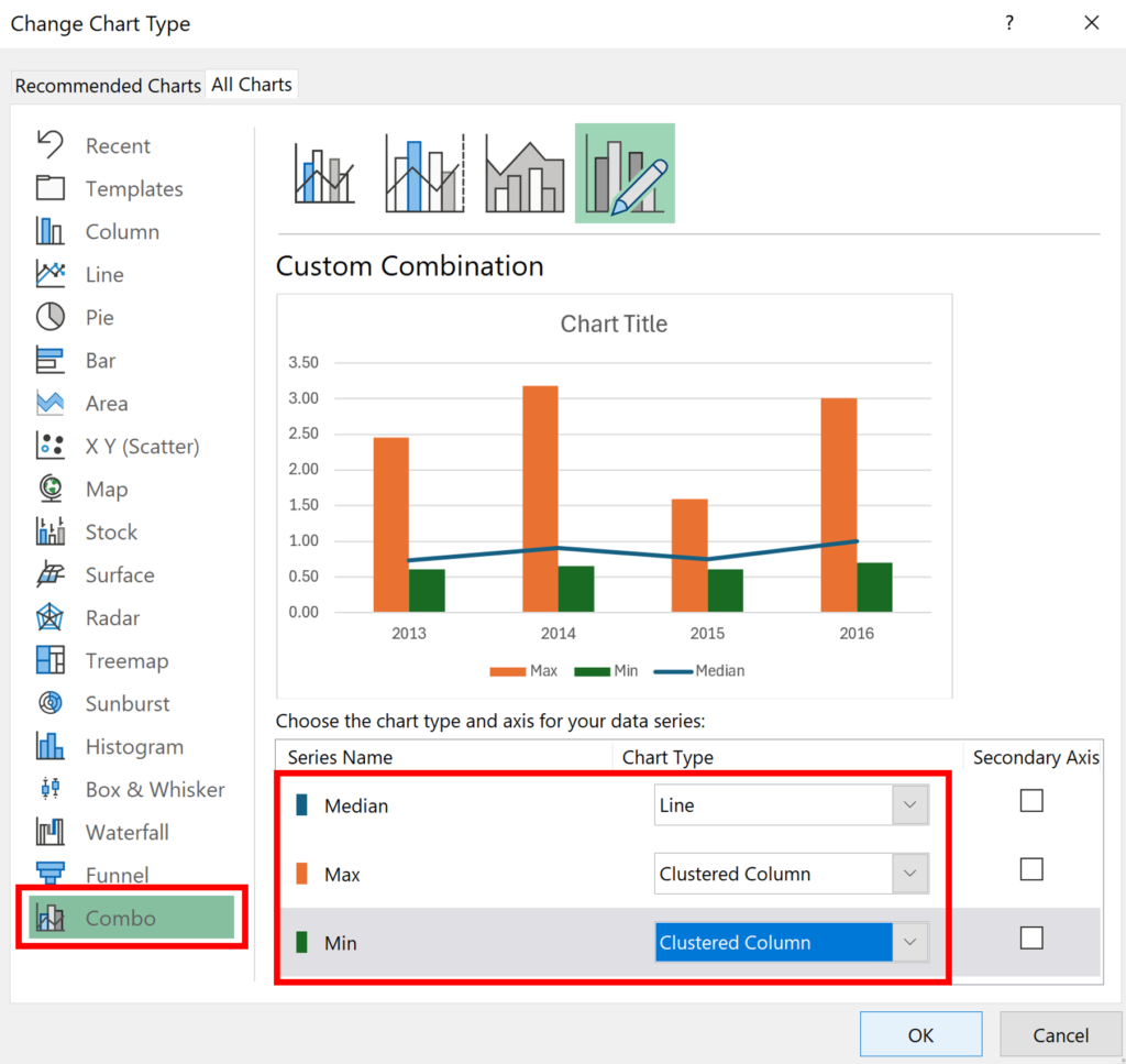
3. Choose the Combo chart type and make the median a Line series, and the minimum and maximum a Clustered Column series.
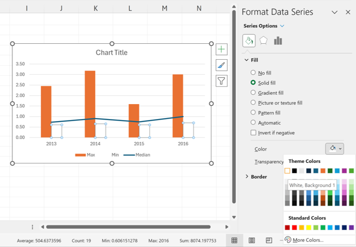
4. Select the minimum series and change the Fill to white.
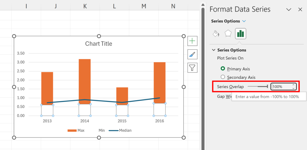
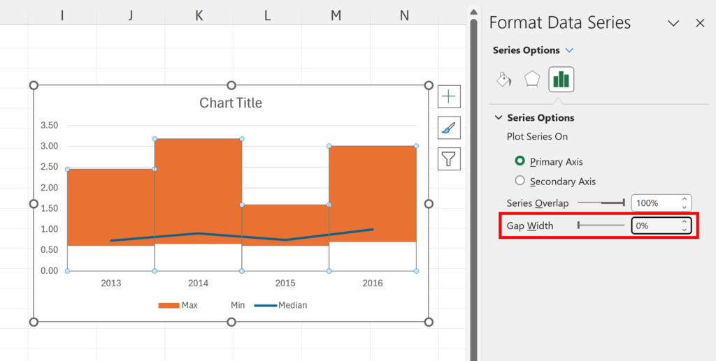
5. Change the Series Overlap to 100%. This hides the bottom of the maximum bars with the white minimum bars.
6. Change the Gap Width to 0% to remove the gaps inbetween the bars.
7. The rest of this is just formatting the chart. Select the maximum series, make the fill color blue and make it 70% transparent. Also, make the border color white.

8. Delete the Legend, Grid Lines and Chart Title. Adjust the size of the chart so that it is thinner and the bars look more in proportion.
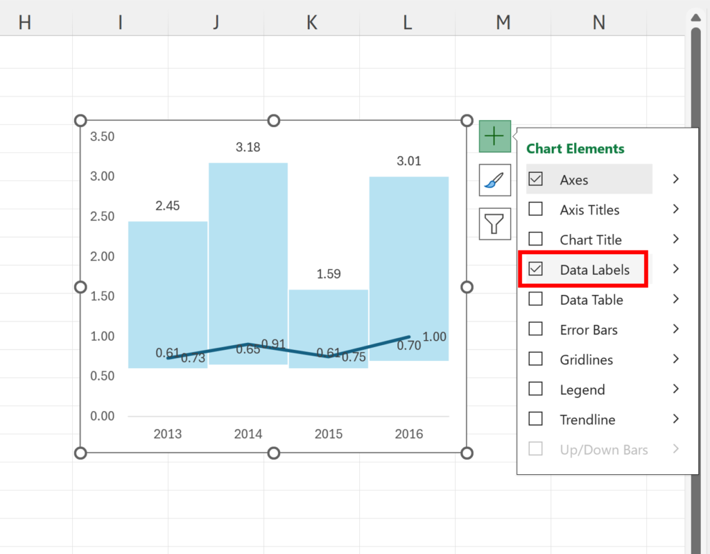
9. Click on the green plus symbol in the corner of the chart and add Data Labels.
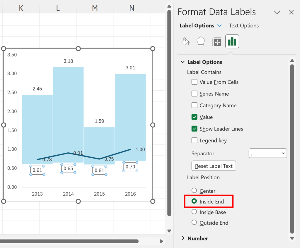
10. We need to move the data labels to make then easier to read. Select the data labels for the minimum series and change the Label Position to Inside End.
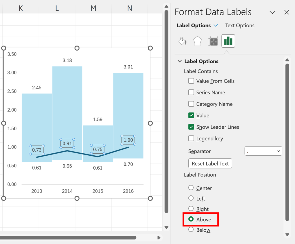
11. Select the data labels for the median series and change the Label Position to Above.
We now have a chart where the lower end of the bars show the minimum for each year and the upper end of the bars show the maximum for each year, while the line shows the median for each year.