Skip to content

    KEA training

    Microsoft Excel tutorials for scientists

    • Home
    • Excel
    • YouTube

    Category: Charts

    • Home
    • Excel
    • Charts
    Charts Excel

    How to make a map in excel using a bubble chart

    December 30, 2023December 30, 2023 Karina Adcock

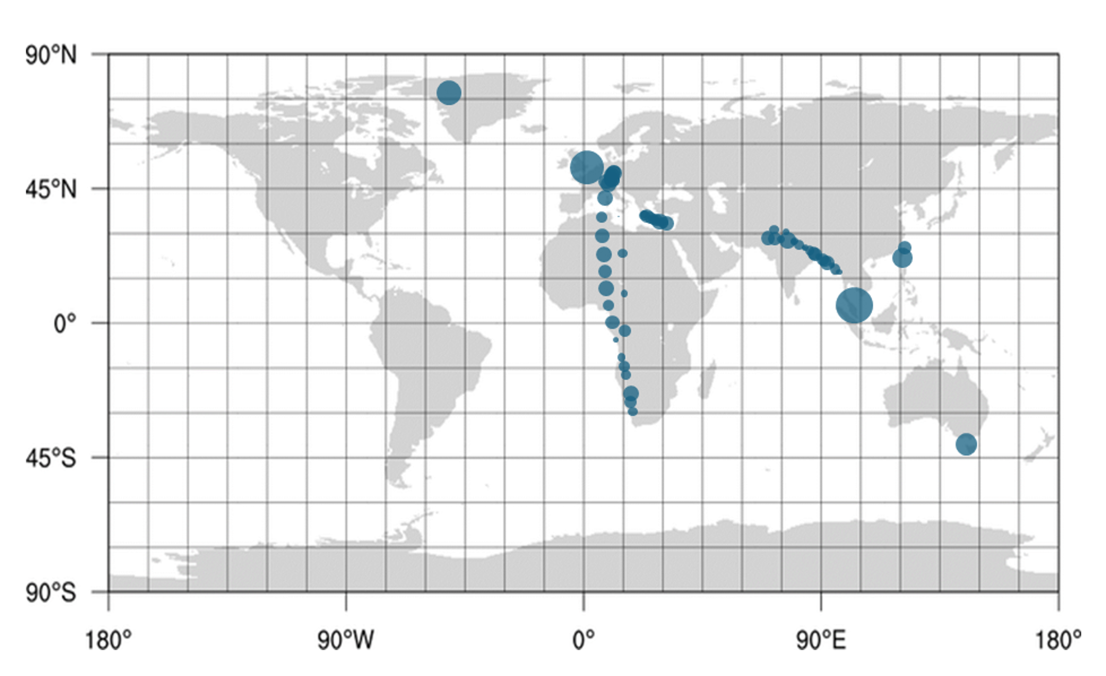
    Plot latitude and longitude coordinates on a bubble chart in excel, and change the background of the chart to an image of a map.

    Read More
    Charts Excel

    How to add subscripts and superscripts into legends in excel

    December 28, 2023December 28, 2023 Karina Adcock

    Excel doesn’t have a feature for adding subscripts and superscripts into legends in excel charts but there is a way around this using symbols.

    Read More
    Charts Excel

    How to conditionally format a bubble chart in excel

    December 27, 2023 Karina Adcock

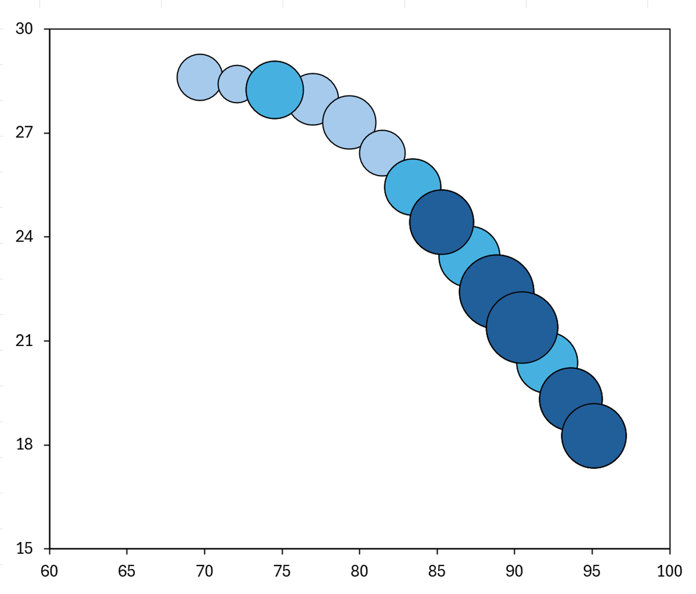
    How to make the bubbles in a bubble chart different colors based on there values, and make it appear as if the chart has conditional formatting, by using an IF formula and making multiple different series.

    Read More
    Charts Excel

    How to save chart formatting to use later in excel

    December 27, 2023December 27, 2023 Karina Adcock

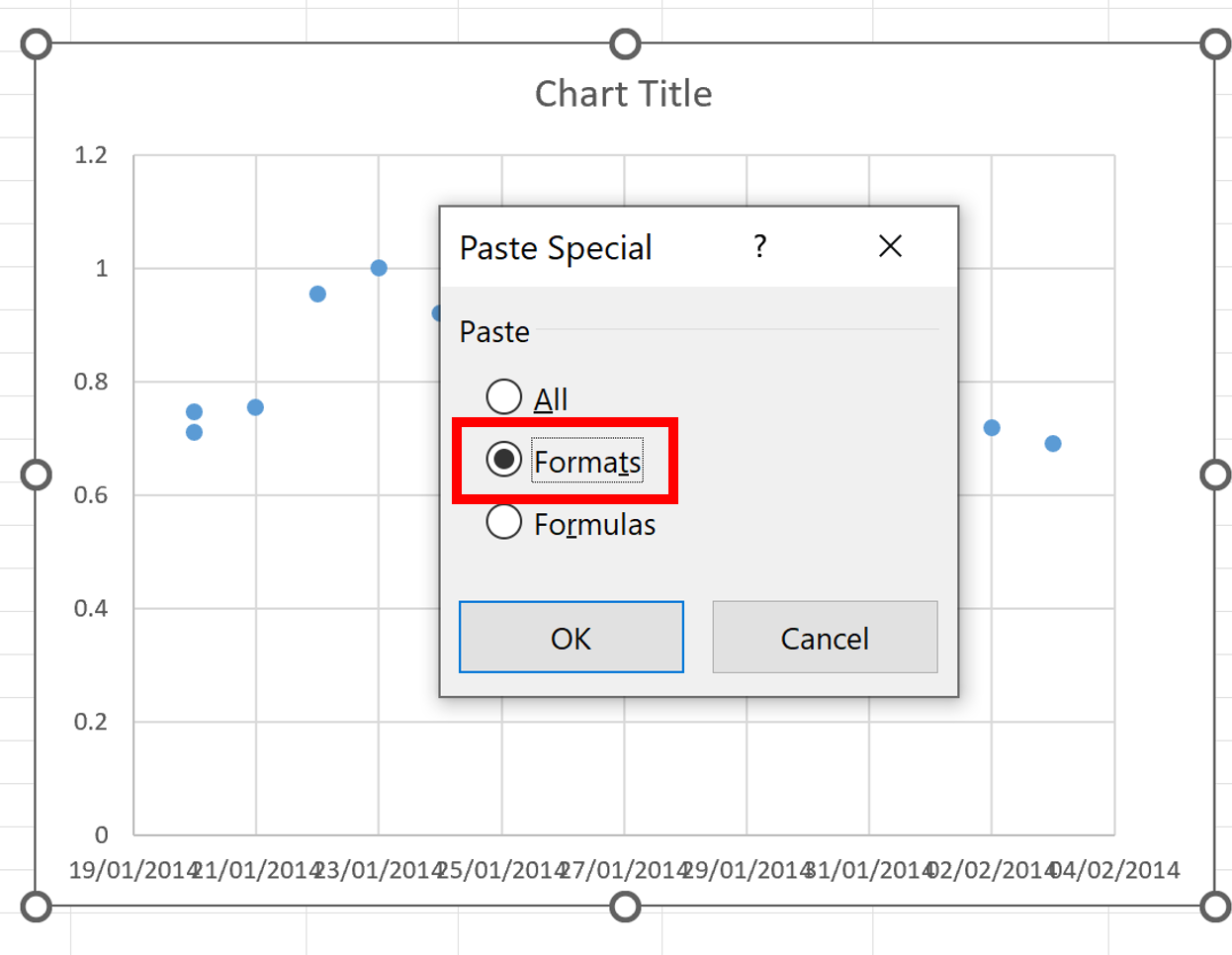
    Quickly copy the formatting from one chart to another in excel and save the formatting to use later.

    Read More
    Charts Excel

    Chart showing the minimum, maximum and average in excel

    December 27, 2023 Karina Adcock

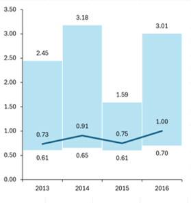
    How to make a chart that shows the minimum, maximum and average values for each year.

    Read More
    Charts Excel

    How to make a bubble chart map in excel

    December 23, 2023 Karina Adcock

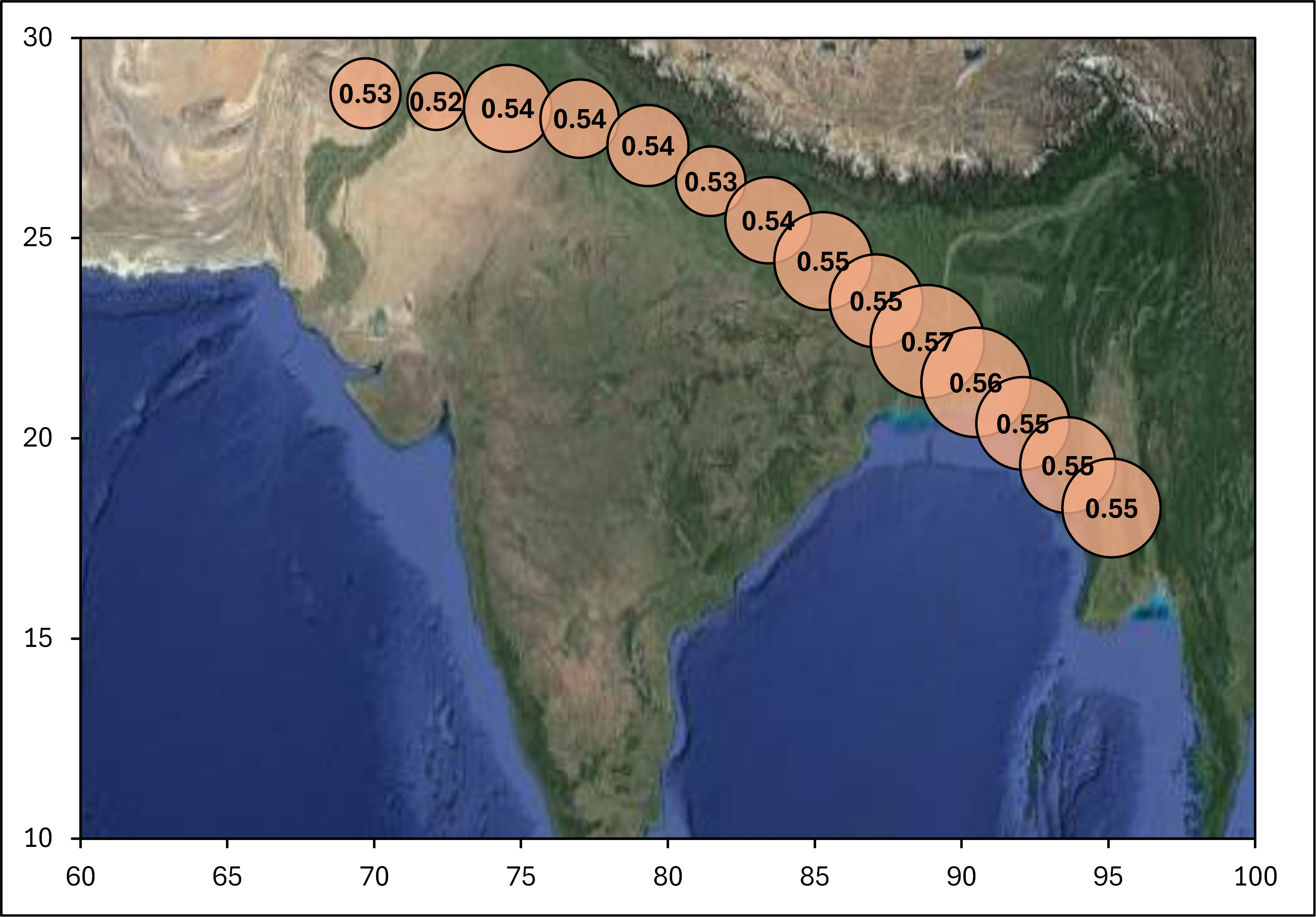
    How to make a bubble chart map with latitude and longitude coordinates in excel.

    Read More
    Charts Excel Formulas

    How to create a dynamic chart with a dropdown box in excel

    May 1, 2023May 1, 2023 Karina Adcock

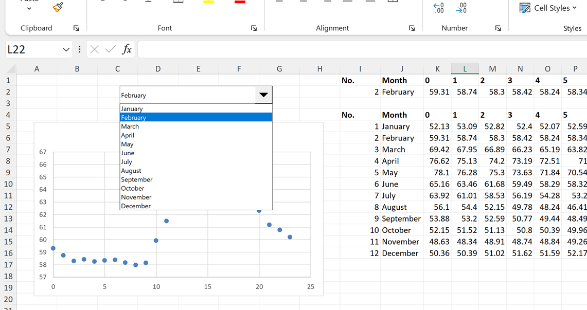
    Use Form Controls and VLOOKUP formula to make a dynamic chart in excel.

    Read More
    Charts Excel Pivot Table

    How to get error bars from a pivot table in excel

    April 11, 2023May 1, 2023 Karina Adcock

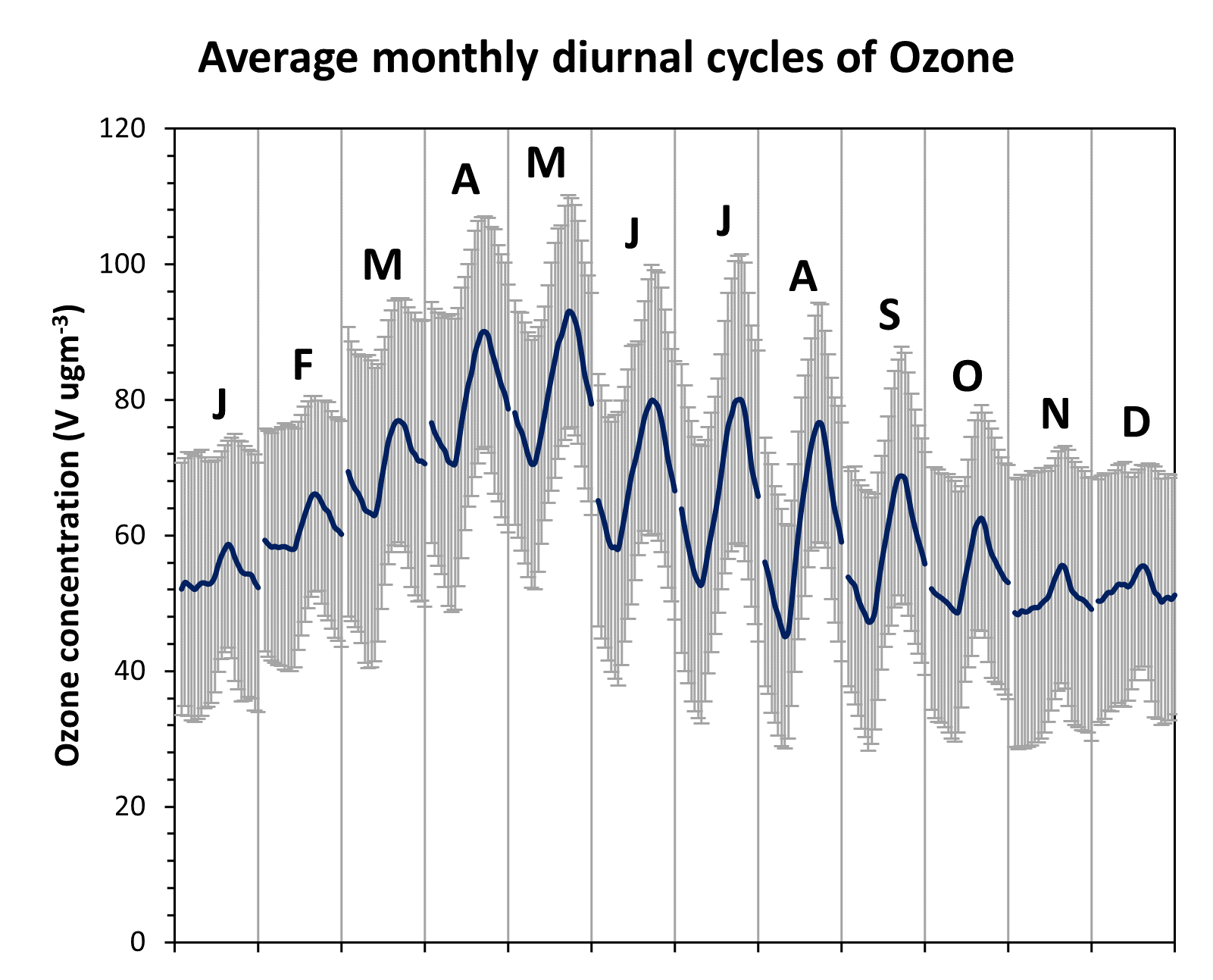
    Use a pivot table to calculate the one sigma standard deviation of the variation in ozone concentrations during the whole of the measurement period and then insert error bars into the chart of one standard deviation.

    Read More
    Charts Excel Pivot Table

    Plot monthly diurnal cycles of ozone using pivot tables in excel

    April 10, 2023May 1, 2023 Karina Adcock

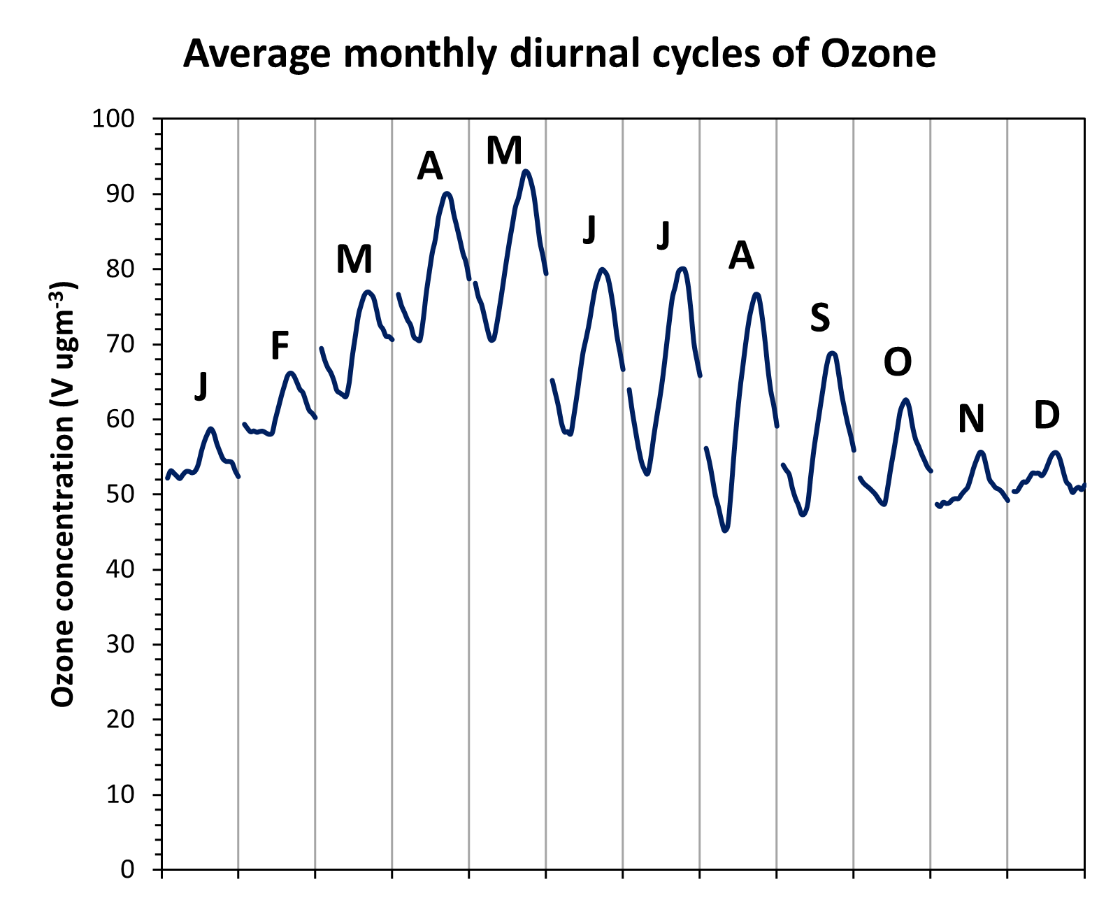
    Hourly ozone concentrations collected at Weybourne in the UK 2010-2014. Make a pivot table to calculate average monthly diurnal (daily) cycles and then plot them in a chart. Format the chart and add text boxes to label each month.

    Read More
    Charts Excel Pivot Table

    How to plot average seasonal daily cycles in excel

    April 7, 2023May 1, 2023 Karina Adcock

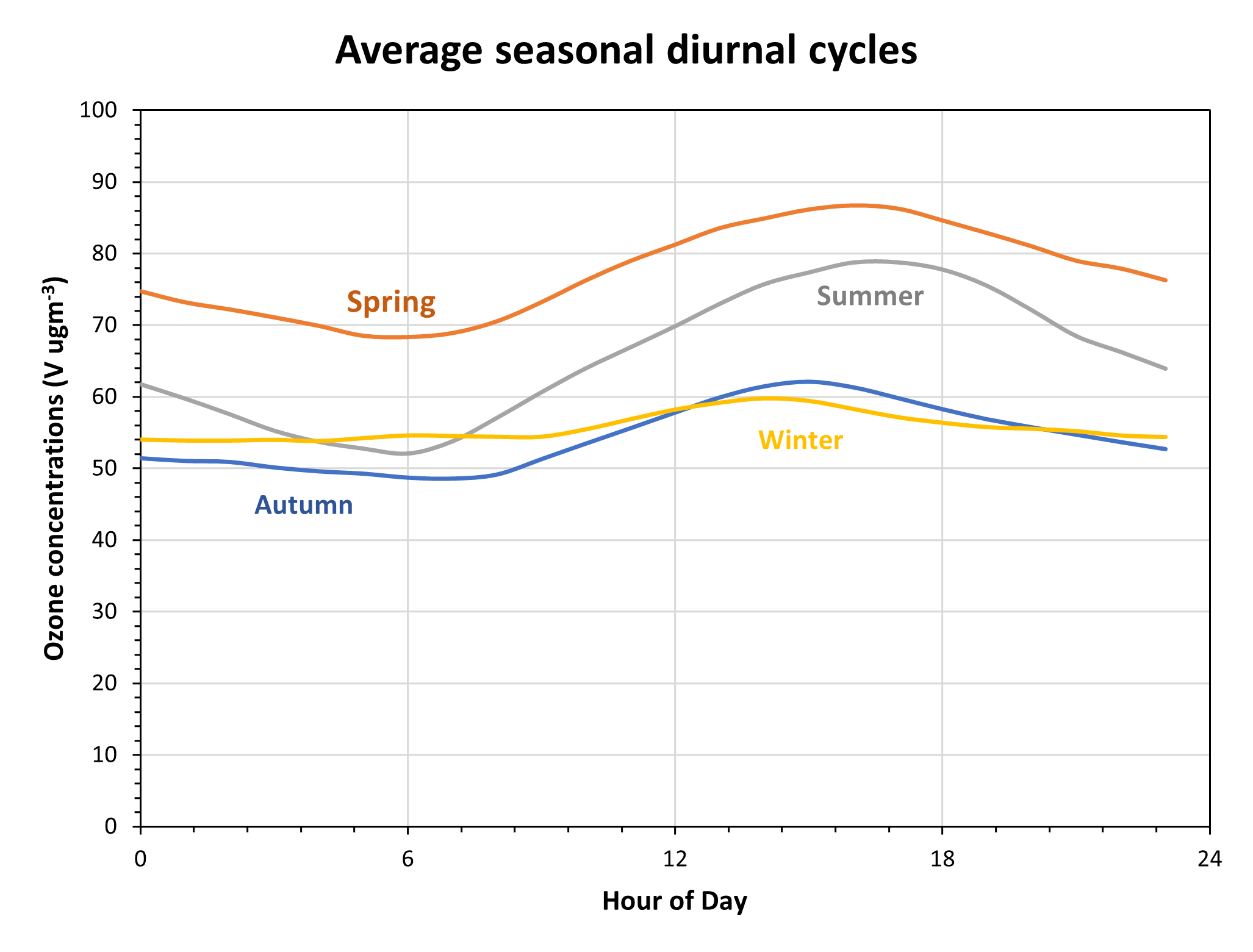
    Chart of average seasonal daily (diurnal/diel) changes with pivot table

    Read More
    All Rights Reserved 2024.
    Proudly powered by WordPress | Theme: Fairy by Candid Themes.